LOOKING BACK:
Holy cow, it is kinda scary how fast 2012 went by. 2012 was a pretty big year for me both in my personal life and here at the blog. I graduated college, got a big boy job and moved into a new place with my lady. With all that personal stuff going on, it shouldn't surprise that the blog suffered a bit in terms of output. I didn't manage to crank out as many blog posts as I have in years past, but I'd like to think that the quality of the posts I did produce make up for the slight drop in quantity.
Regardless of how many posts I cranked out, this was by far a banner year for Battle Hymns. I had the pleasure of contributing my "wisdom" to a couple of other blogs, which was an honor. I contributed a piece to Sarah's Special Needs in Strange Worlds event at Bookworm Blues and took over the Speculative Scotsman, if only for a day, while Niall was on vacay.
In addition to the guest posts, and single handedly averting the Mayan-pocalypse, (yeah, that was me), I also conducted four author interviews, which has got to be the highlight of this blogging experience for me so far! Check 'em out:
Tim Marquitz
Michael J. Sullivan
Jeff Salyards (and part 2)
Paul S. Kemp
Yep, a pretty awesome year! Before I start looking ahead, I just want to thank everyone who has made Battle Hymns a piece of their lives. It's you people who visit, leave comments and all that good stuff that keep me driven and keep me cranking out the blog material. I hope I give you guys plenty of good reason to keep coming around in 2013!
LOOKING AHEAD:
My shelves are already stuffed to near capacity, but I'm sure I'll plump 'em out even further in 2013. There's already a few choice items sitting pretty, ready for review, and even more sitting there waiting for my attention. Here's a little glimpse at what I hope to have in store for the blog in 2013...
BOOKS:
I don't often pony up for the brand new stuff, I simply don't have the spendin' money for it. On occasion however, I'll shell out for a book that I just can't wait to get my hands on. Last year, the big release I shelled out for was Stephen King's The Wind Through the Keyhole, which, given my history with the Dark Tower series, was a fun book to be reading and reviewing around the time of release. I expect Joe Hill's latest, Nos4a2 will have the honor of being the release I pony up the cash for this coming year.
I've been increasingly impressed with Mr. Hill with each work of his I read. Both his prose works and his works in comics have been great, and I'm hungry for more of both. Lucky for me, 2013 should bring not only his latest prose work, but also the conclusion of his fantastic Locke & Key series. For that reason alone, signs point towards the fact that 2013 should be a good year, however there's some other good lookin' stuff on the horizon, both new and not so new, that I have my eye on. Here's a glimpse:
The Red Knight: I'm definitely intrigued by this early 2013 release, and I have a copy of it on my Kindle, so expect to see this one get covered here early in the year.
Red Country: 2012 was a Joe Abercrombie-less year for me, and that is sad. I'll be looking to get my hands on his latest before too long, as I have a hankering for some Bloody Nine.
The Coldest War: I belatedly began Ian Tregillis' The Milkweed Triptych this year, and enjoyed it immensely. With the second book out and third one due, I'm looking to get a move on in this series.
Railsea: It wouldn't be much of a year if I didn't read something by China Mieville. I'm looking to keep pace with his publications by reading his latest, albeit a year later.
Rise of Empire: Another series whose grip I got caught in this year. Another series I'm looking to dig deeper into.
Some authors I've never read but hope to in 2013:
Nick Harkaway
Adam Roberts
Courtney Schafer
Felix Gilman
Robert Jackson Bennett
Teresa Frohock
COMICS:
I'm always on the lookout for great new comic reads, but I've had to govern my comics spending more closely lately and limit the number of active titles in my pull box. However, in 2013, for the first time since I became a comics reader, there's going to be a gaping hole in my monthly comics reading when Sweet Tooth finishes up. Lucky for me, and every other comics reader out there, we'll see a new Jeff Lemire comic sometime in 2013 in the form of Trillium, a science fiction love story that spans centuries.
While Trillium is sure to make me happy, here's some other titles I'm looking forward to:
Walrus: It's no secret that I'm a big fan of Brandon Graham. In Spring of 2013, PictureBox Inc. will release a printed edition of his sketchbook. I'm hoping it will be like a tangible version of his blog, which is a cool mix of comics, and weirdness.
Sullivan's Sluggers: I purchased this months ago on Kickstarter, and still haven't got my copy. I gave them my mailing address though, so I'm hoping I'll see my copy soon. I've been waiting for this one for months, so I'm pretty excited to finally get my hands on it.
East of West: I've had mixed feelings about the Jonathan Hickman material that I've read in the past, but East of West which promises to be a "sci-fi western set in a dystopian America where all hope for the future rests in the four horsemen of the apocalypse" (quoted straight from the Image website). I dare say from that description that East of West sounds like it is right up my alley. I'll for sure be checking out a few issues of this title to get a taste for it.
MUSIC:
2012 was a bit of a music fail for me, so I hope to make more of an effort to experience more of it in 2013. That means going to more live shows and listening to more music on a daily basis. Right now, my work situation is pretty conducive to listen to whatever I want for a good chunk of the day, so that should help. As for stuff I'm looking forward to, my fingers are crossed that there'll be a new Red Fang album for me to listen to before the end of the year.
So there you go, a good look at some of the stuff I'm looking forward to in 2013. And now I turn things over to you faithful Battle Hymns readers: What Books, comics, and musics are you pumped about for 2013? Head to the comments section to let the world know!
Showing posts with label graphic novels. Show all posts
Tuesday, January 1, 2013
Monday, November 12, 2012
Graphic Novel Review: Like a Sniper Lining Up His Shot
The Jacques Tardi comics I've read so far have been bonafide hits for me. Just check out my reviews for It Was the War of the Trenches and The Arctic Marauder if you don't believe me. I've had such good luck with Tardi's work that I've gone as far as stockpiling yet-to-be-read Tardi comics on my shelf, so that they are readily available should the desire to read some incredible French comics strike.
When the desire struck me this time around, I picked up Like a Sniper Lining Up His Shot. This is the first Jacques Tardi comic I've read where he's not the sole artist working on the graphic novel. For Sniper he adapted a novel written by French writer Jean-Patrick Manchette.
The story follows a hardboiled bad-ass by the name of Martin Terrier, who's a mercenary-turned-assassin. On the opening page of the graphic novel, he executes (pun intended) what he plans on being his last ever job in the killer for hire business. From there he plans to take his savings, collect a long-lost lady love, and retire to some discreet, and warm, location to live out the rest of his days.
The thing is, his employers aren't too happy with his decision, and to make matters worse, old enemies start popping up in Terrier's life. Before too long, Terrier finds himself reluctantly dragged back into the life he was trying to leave behind.
Like a Sniper Lining Up His Shot definitely has a plot with a lot of wear on it. We've all read a book or seen a movie where some tired old assassin is gonna do just one last job, then call it quits and retire with a lady somewhere warm. Sure, it makes for a decent story but it felt a little tired out on this most recent go-round.
I think what makes the "Just one last job" plot-type a success, is a character that the reader, or viewer can root for, someone you wish could have a chance at a better life. Well, that's not really the case here. Terrier is a bit of a seedy bastard, definitely on the unsavory side of things, so it was hard for me to wish him well. If you can get past his cold-heartedness, and his penchant for brutal violence, you could certainly root for the guy based on how damn resourceful he is in a pinch. By "resourceful" I mean not in the MacGyver sense, I mean resourceful in that he can decisively handle situations where he's being tailed, held at gunpoint, being back-stabbed...that kind of stuff. He's pretty much a cold-blooded bad-ass when it comes down to it.
The novel this graphic novel is based on was written by Jean-Patrick Manchette and Jacques Tardi handled the adaptation from book to comic. It is an adaptation that feels a little rough around the edges at times. I think it is always hard to adapt a book into a graphic novel, the written word doesn't necessarily always translate that smoothly into words and pictures. You definitely need a novel high on visuals in order to make the adaptation work, and even when you do have that situation, like here with Sniper, there are always some crucial parts that don't adapt that well to the new format. This results in pages that are way too text heavy for the comics medium, or word bubbles that awkwardly contain a paragraph worth of text.
Like a Sniper Lining Up His Shot definitely fell victim to that text-onslaught, particularly towards the end. The times when Sniper loses that harmony between words and art always jarred me out of my reading groove, and forced me into this uncomfortable place where the words and art were at odds with each other. As you might imagine, this definitely took away from the overall experience.
The greatest piece of this graphic novel was easily Tardi's art. As always with a Tardi graphic novel, I was very impressed with the quality on the art front. Tardi's work here lacks some of the raw emotion of It was the War of the Trenches and some of stylistic flair of The Arctic Marauder, but it is still quality work. Unlike my other two Tardi reads, this one is much more action packed, and I was impressed to see that Tardi could make action scenes come to life so fluidly. Tardi's black and white art is definitely a spot-on match for this gritty crime story.
Even though Like a Sniper Lining Up His Shot has a plot that isn't doing anything new, and features an adaptation that doesn't translate so well at times, this is still an enjoyable graphic novel. There was enough scenes of action and intrigue to make me forget my plot gripes every now and again, and as always, Tardi's art was a pleasure to drink in. This is probably my least favorite Jacques Tardi graphic novel yet, but despite a few warts, I still enjoyed it.
Grade: C+
When the desire struck me this time around, I picked up Like a Sniper Lining Up His Shot. This is the first Jacques Tardi comic I've read where he's not the sole artist working on the graphic novel. For Sniper he adapted a novel written by French writer Jean-Patrick Manchette.
The story follows a hardboiled bad-ass by the name of Martin Terrier, who's a mercenary-turned-assassin. On the opening page of the graphic novel, he executes (pun intended) what he plans on being his last ever job in the killer for hire business. From there he plans to take his savings, collect a long-lost lady love, and retire to some discreet, and warm, location to live out the rest of his days.
The thing is, his employers aren't too happy with his decision, and to make matters worse, old enemies start popping up in Terrier's life. Before too long, Terrier finds himself reluctantly dragged back into the life he was trying to leave behind.
Like a Sniper Lining Up His Shot definitely has a plot with a lot of wear on it. We've all read a book or seen a movie where some tired old assassin is gonna do just one last job, then call it quits and retire with a lady somewhere warm. Sure, it makes for a decent story but it felt a little tired out on this most recent go-round.
I think what makes the "Just one last job" plot-type a success, is a character that the reader, or viewer can root for, someone you wish could have a chance at a better life. Well, that's not really the case here. Terrier is a bit of a seedy bastard, definitely on the unsavory side of things, so it was hard for me to wish him well. If you can get past his cold-heartedness, and his penchant for brutal violence, you could certainly root for the guy based on how damn resourceful he is in a pinch. By "resourceful" I mean not in the MacGyver sense, I mean resourceful in that he can decisively handle situations where he's being tailed, held at gunpoint, being back-stabbed...that kind of stuff. He's pretty much a cold-blooded bad-ass when it comes down to it.
The novel this graphic novel is based on was written by Jean-Patrick Manchette and Jacques Tardi handled the adaptation from book to comic. It is an adaptation that feels a little rough around the edges at times. I think it is always hard to adapt a book into a graphic novel, the written word doesn't necessarily always translate that smoothly into words and pictures. You definitely need a novel high on visuals in order to make the adaptation work, and even when you do have that situation, like here with Sniper, there are always some crucial parts that don't adapt that well to the new format. This results in pages that are way too text heavy for the comics medium, or word bubbles that awkwardly contain a paragraph worth of text.
Like a Sniper Lining Up His Shot definitely fell victim to that text-onslaught, particularly towards the end. The times when Sniper loses that harmony between words and art always jarred me out of my reading groove, and forced me into this uncomfortable place where the words and art were at odds with each other. As you might imagine, this definitely took away from the overall experience.
The greatest piece of this graphic novel was easily Tardi's art. As always with a Tardi graphic novel, I was very impressed with the quality on the art front. Tardi's work here lacks some of the raw emotion of It was the War of the Trenches and some of stylistic flair of The Arctic Marauder, but it is still quality work. Unlike my other two Tardi reads, this one is much more action packed, and I was impressed to see that Tardi could make action scenes come to life so fluidly. Tardi's black and white art is definitely a spot-on match for this gritty crime story.
Even though Like a Sniper Lining Up His Shot has a plot that isn't doing anything new, and features an adaptation that doesn't translate so well at times, this is still an enjoyable graphic novel. There was enough scenes of action and intrigue to make me forget my plot gripes every now and again, and as always, Tardi's art was a pleasure to drink in. This is probably my least favorite Jacques Tardi graphic novel yet, but despite a few warts, I still enjoyed it.
Grade: C+
Thursday, October 4, 2012
JLA Earth 2: Grant Morrison and Frank Quitely. Two of my most favorite comic creators. This duo tends to really step their game up when they work together. They're a recipe for a golden comic.... right? Well, that has been the case in the past. See: Exhibit A, B, and C.
Uh, but there's been a couple less than stellar offerings from them too, see: Item One and Two. But it's been awhile, since I've read ones that I would rate as a miss rather than a hit...until JLA Earth 2.
Not only does this one rate as a miss, I'd rate it as an all-around dud of a comic. In fact, there's very little I can say positively about this comic. Here's the premise: The Earth that all our fave Justice League heroes live on is "good" planet. Good guys like Superman, Wonder Woman, The Flash, Batman, and all the rest, take care of the people and the planet. Well, what if there was another Earth out there in a parallel dimension where everything was the exact opposite?!?! Whoa!
On this anti-matter planet bad dudes like Ultraman, Super Woman, The Owl, Power Ring, and Johnny Quick are part of the Crime Syndicate of Amerika and they pretty much rule their depraved and corrupt planet with an iron fist. So when Lex Luthor, who is a good guy on this other planet, travels across dimensions to enlist the help of the JLA our heroes have to decide if they stand for justice in our world or on all worlds.
Maybe I shouldn't have based my purchase of this one purely on the creators...had I at least read the back blurb I might have let this one pass me by. But I didn't. I read the whole damn thing too, despite this being a wholly uninspired work from two creators who appeared to be simply phoning this one in. The fact of the matter is, there is nothing really special about this one at all.
Morrison's plot is entirely too predictable and lacking in anything that could be referred to as an interesting plot development. The one twist, which came late in the game, seemed like it was just thrown in there as a way of giving the story a bit more life, but it didn't really work. I guess I could interpret this story has having a somewhat hidden message about the nature of mainstream comics and how the good guys always win, how it is a pretty much pre-ordained thing that is taken for granted. Yeah, that's great and all, but isn't that why people read superhero comics, so they can see their heroes win?
Though I was disappointed with Morrison, I was even more disappointed with Quitely. This is easily my least favorite work of his I've seen so far. The whole time I was reading this I got the feeling that he must have been bored with the work, because even the characters in the comic seem bored. There's little to no life in any of these characters. Additionally, Morrison dials up a bunch of full page and double page splashes for Quitely, who responded by delivering some incredibly dull pages of art. There's Green Lantern creating giant hand constructs that hold the moon, a tombstone, a giant space base that looks silly, and the old burnt out stand-by: heroes flying through the air. I love Quitely's art because he has the ability to make things look fresh and new, and he manages to breathe life into his characters, but that ability is completely AWOL in JLA Earth 2. This stuff is just flat out weak.
I wish I could say something positive about JLA Earth 2, but I really can't. I was completely let down by this comic, and the two creators who in the past have delivered some amazing stuff. Based what I know Morrison and Quitely are capable of, and the lack luster product they produced here, I just can't recommend JLA Earth 2. I've come to expect far greater things from this team, and they completely failed to deliver here. This is one to pass by.
Grade: F
Thursday, September 27, 2012
Graphic Novel Review: The Underwater Welder
Prior to it's release, Jeff Lemire's The Underwater Welder was probably my most anticipated release of the year. Shit, I've been talking about it and thinking about it for over a year now. Then it came out, and I flipped through it, drooled a bit over the art, showed if off to my lady, and proudly displayed it on my shelf next to all my other Jeff Lemire stuff. When the next opportunity arose for some comic reading I passed it by, and did so again and again for a few weeks.
The reason for the delay was that Lost Dogs had just recently been re-released, and I had jumped at the first opportunity to read that when it came out. With The Underwater Welder coming out hot on it's heels, and Sweet Tooth nearing it's end I thought it would be a good idea to ration out my Jeff Lemire reads as much as possible.
Well, Then this guy went it reviewed it, which I'm not gonna lie, made me all jealous. That coincided with a time where I just needed to read something guaranteed to be awesome, and lo and behold, there was The Underwater Welder just sitting there on my shelf waiting for me. Problem solved.
The Underwater Welder follows Jack Joseph, an underwater welder who works on an oil rig just off the coast of Nova Scotia. Jack and his wife are about to have their first child. The looming birth and the challenges of fatherhood have put Jack into a state of numbed detachment. Lacking the ability to work through his stress, fears and anxiety, Jack retreats to the ocean depths. Jack's diving into the depths is analogous to his pulling away from his wife and his unborn son. However, as Jack dives, he experiences a supernatural occurrence that brings back long-buried memories of his own father, and gives him insight into his own life's path.
I've had the pleasure of reading damn near everything Jeff Lemire has put into print. With the exception of most of his DC comics work, I've read all of his independent, creator-owned comics work. I've been very impressed with all his stuff so far. I mean, the guy is easily one of my favorite comic creators. Sweet Tooth stands out as probably my favorite monthly comic right now. The guy is high, high on my list. So I was very happy to discover that The Underwater Welder is his very best work to date.
When I chatted with Lemire at the 2011 Emerald City Comicon, he told me that Underwater Welder is the comics work he is most proud of, and after reading this, I can clearly see why.
Never before has Lemire's art looked this good. Sure, it's not for everyone, and I think Niall summed it up well when he referred to Lemire's art as an "acquired taste". Though I like how Lemire's sometimes rough and sketchy art seems to channel raw emotion, I've talked to people who think he sucks. Granted, "he sucks" was about the full extent of their argument, but nonetheless, it's an insight. Anyway, I was impressed. For my money, this is his best work with the pen and brush.
Lemire uses two distinct styles to tell his story here. There's his familiar ink line and jet-black india ink that dominated his early works such as Essex County and The Nobody. I thought Lemire's line work when working in this style looked sharp and better than ever. It's impressive how much his skill has developed over the years.
The second style Lemire uses is ink line with ink wash, which allows for a softer look and gives the story a variety of grey tones which Lemire often used to juxtapose the straight black and white art. Flipping back through the book now as I write this review, it is interesting to see how Lemire transitioned between the two styles. Sometimes this transition is sneakily smooth, and other times it is jarringly noticeable and geared to make an impact. Not that he ever seems to have any problems delivering an emotional kick, but by using these two techniques, Lemire was able to create a lot of the emotional impact of the story, simply through the style of ink on the page.
If Jeff Lemire had a superpower, it would be the ability to make people break down and cry by using only pictures and words. As I've experienced through his other works, Lemire manages to deliver a narrative that is written in such a way that the people, their lives and the events, are incredibly easy to understand and relate to. Lemire always amazes me with his ability to clearly depict humans working through these basic, raw emotions that we all have, but are often unable to articulate or even comprehend. It's kinda uncanny, but beautiful and heart-wrenching at the same time.
No matter how you look at it, The Underwater Welder is a powerhouse of a graphic novel. Jeff Lemire is at the top of his game here. His art has never looked better and his writing, plotting, and scripting is near perfect. This is an impressive comic, and one that should be read by many. You wont get punch-ups and tight underpants, but you will get a story about fathers and sons, death and birth, an exploration into the depths of reality. I loved it, and I think you will too.
Grade: A+
The reason for the delay was that Lost Dogs had just recently been re-released, and I had jumped at the first opportunity to read that when it came out. With The Underwater Welder coming out hot on it's heels, and Sweet Tooth nearing it's end I thought it would be a good idea to ration out my Jeff Lemire reads as much as possible.
Well, Then this guy went it reviewed it, which I'm not gonna lie, made me all jealous. That coincided with a time where I just needed to read something guaranteed to be awesome, and lo and behold, there was The Underwater Welder just sitting there on my shelf waiting for me. Problem solved.
The Underwater Welder follows Jack Joseph, an underwater welder who works on an oil rig just off the coast of Nova Scotia. Jack and his wife are about to have their first child. The looming birth and the challenges of fatherhood have put Jack into a state of numbed detachment. Lacking the ability to work through his stress, fears and anxiety, Jack retreats to the ocean depths. Jack's diving into the depths is analogous to his pulling away from his wife and his unborn son. However, as Jack dives, he experiences a supernatural occurrence that brings back long-buried memories of his own father, and gives him insight into his own life's path.
I've had the pleasure of reading damn near everything Jeff Lemire has put into print. With the exception of most of his DC comics work, I've read all of his independent, creator-owned comics work. I've been very impressed with all his stuff so far. I mean, the guy is easily one of my favorite comic creators. Sweet Tooth stands out as probably my favorite monthly comic right now. The guy is high, high on my list. So I was very happy to discover that The Underwater Welder is his very best work to date.
![]() |
| Courtesy: http://jefflemire.blogspot.com/ |
When I chatted with Lemire at the 2011 Emerald City Comicon, he told me that Underwater Welder is the comics work he is most proud of, and after reading this, I can clearly see why.
Never before has Lemire's art looked this good. Sure, it's not for everyone, and I think Niall summed it up well when he referred to Lemire's art as an "acquired taste". Though I like how Lemire's sometimes rough and sketchy art seems to channel raw emotion, I've talked to people who think he sucks. Granted, "he sucks" was about the full extent of their argument, but nonetheless, it's an insight. Anyway, I was impressed. For my money, this is his best work with the pen and brush.
Lemire uses two distinct styles to tell his story here. There's his familiar ink line and jet-black india ink that dominated his early works such as Essex County and The Nobody. I thought Lemire's line work when working in this style looked sharp and better than ever. It's impressive how much his skill has developed over the years.
![]() |
| Courtesy: http://jefflemire.blogspot.com/ |
The second style Lemire uses is ink line with ink wash, which allows for a softer look and gives the story a variety of grey tones which Lemire often used to juxtapose the straight black and white art. Flipping back through the book now as I write this review, it is interesting to see how Lemire transitioned between the two styles. Sometimes this transition is sneakily smooth, and other times it is jarringly noticeable and geared to make an impact. Not that he ever seems to have any problems delivering an emotional kick, but by using these two techniques, Lemire was able to create a lot of the emotional impact of the story, simply through the style of ink on the page.
If Jeff Lemire had a superpower, it would be the ability to make people break down and cry by using only pictures and words. As I've experienced through his other works, Lemire manages to deliver a narrative that is written in such a way that the people, their lives and the events, are incredibly easy to understand and relate to. Lemire always amazes me with his ability to clearly depict humans working through these basic, raw emotions that we all have, but are often unable to articulate or even comprehend. It's kinda uncanny, but beautiful and heart-wrenching at the same time.
No matter how you look at it, The Underwater Welder is a powerhouse of a graphic novel. Jeff Lemire is at the top of his game here. His art has never looked better and his writing, plotting, and scripting is near perfect. This is an impressive comic, and one that should be read by many. You wont get punch-ups and tight underpants, but you will get a story about fathers and sons, death and birth, an exploration into the depths of reality. I loved it, and I think you will too.
Grade: A+
Saturday, September 8, 2012
Graphic Novel Review: Wonton Soup & Wonton Soup 2
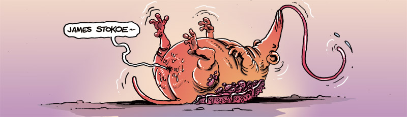
I have let it be known around these parts before, that I am a huge fan of the comics work of James Stokoe. The man is a flippin' genius. In my ongoing effort to own every piece of comics work the man has ever created, I recently exchanged some of my hard-earned cash in return for two of his early comics works: Wonton Soup, and Wonton Soup 2: Hyper Wonton Soup 2 Two Ton Soup: The Quickening 2. That's one hell of a mouthful for a title, but naming aside for now, lets focus on the magic that is Wonton Soup.
Wonton Soup focuses on the exploits of Johnny Boyo, a space trucker who, thanks to an attack on his spacecraft by some space ninjas, finds himself back on the planet of Plaxos. Not exactly the place he wants to be since Plaxos is the home of his former culinary school, where he rose to the ranks of star-pupil before suddenly dropping out. His lady lives there too, and within a few hours of his return, he finds himself back in the good graces of his chick, and challenged to a cook-off by the school's current top-chef twins. Along the way there's plenty of crazy-ass shit that goes on, not to mention some nutty recipes and some crazy cooking exploits.
At the very moment when I finished reading Wonton Soup this graphic novel went down as the most out-there and crazy thing I've read in the world of comics. That lasted a grand total of about 24 hours...which is when is when I finished reading Wonton Soup 2: Hyper Wonton Soup 2 Two Ton Soup: The Quickening 2. Take everything that was crazy, fucked up, strange and out-there about Wonton Soup and multiply that by about a thousand you got yourself the content of the second Wonton Soup graphic novel.
Johnny Boyo and his partner Deacon are still truckin' around space when they get high as fuck, trip balls for a few days, and wake up on a mostly deserted planet. While they set out towards the only sign of civilization, we are given the wondrous back-story of Deacon, Johnny's pervy compadre. The entire back-story is a hilarious trip, but it is primarily memorable for the fact that during said back-story, Stokoe saw fit to give the world "Sex-Bear". For that, I am eternally grateful. And eternally scarred.
I gotta say that these Wonton Soup comics lack the cohesion and sharpness of Stokoe's work on Orc Stain, but these comics sure do display his ability to write stories that are absolutely hilarious and filled with incredibly creative and fantastic ideas. Both of these graphic novels are packed with one crazy/amazing idea after the other. Stokoe has an amazing ability to tap into a vein of creativity that brings out some of the most inventive shit to ever hit the printed page. Wonton Soup and Wonton Soup 2 are pure madcap genius.
Oh, this stuff is absolutely gorgeous to look at too. Stokoe is easily one of my favorite artists in the business. There are times when I look at one of his pages and totally lose myself because there is so much minute detail, and stuff going on. I've wondered many times how long a particular page took him to draw, because some pages are so jammed with amazing detail, it is mind blowing. This is the kind of art that really engenders itself to the reader. Just by looking at Stokoe's work I can instantly tell that hours and hours of painstaking work were lovingly put into each page, and when the creator of a work cares that much about the quality, I find that it translates to high quality work.
Yes, Wonton Soup and Wonton Soup 2 might be two of the weirdest things I've ever read, but they are an absolute blast to read. You don't so much get a story as you do an experience. You gotta trust me, just do yourself a favor and go find something by James Stokoe and enjoy being entertained. You know what, I'll do some of the leg work for you. Here you go:
You're welcome.
Seriously, check out his website, which has comics stuff for you to enjoy. Dude also has a tumblr, which is cool too. All good stuff. Once you are gorged on the stuff you can see for free, check out the other James Stokoe related mega-awesomenes I've reviewed or discussed here at the blog.
Wonton Soup Grade: A-
Wonton Soup 2 Grade: A
Wonton Soup focuses on the exploits of Johnny Boyo, a space trucker who, thanks to an attack on his spacecraft by some space ninjas, finds himself back on the planet of Plaxos. Not exactly the place he wants to be since Plaxos is the home of his former culinary school, where he rose to the ranks of star-pupil before suddenly dropping out. His lady lives there too, and within a few hours of his return, he finds himself back in the good graces of his chick, and challenged to a cook-off by the school's current top-chef twins. Along the way there's plenty of crazy-ass shit that goes on, not to mention some nutty recipes and some crazy cooking exploits.
At the very moment when I finished reading Wonton Soup this graphic novel went down as the most out-there and crazy thing I've read in the world of comics. That lasted a grand total of about 24 hours...which is when is when I finished reading Wonton Soup 2: Hyper Wonton Soup 2 Two Ton Soup: The Quickening 2. Take everything that was crazy, fucked up, strange and out-there about Wonton Soup and multiply that by about a thousand you got yourself the content of the second Wonton Soup graphic novel.
Johnny Boyo and his partner Deacon are still truckin' around space when they get high as fuck, trip balls for a few days, and wake up on a mostly deserted planet. While they set out towards the only sign of civilization, we are given the wondrous back-story of Deacon, Johnny's pervy compadre. The entire back-story is a hilarious trip, but it is primarily memorable for the fact that during said back-story, Stokoe saw fit to give the world "Sex-Bear". For that, I am eternally grateful. And eternally scarred.
I gotta say that these Wonton Soup comics lack the cohesion and sharpness of Stokoe's work on Orc Stain, but these comics sure do display his ability to write stories that are absolutely hilarious and filled with incredibly creative and fantastic ideas. Both of these graphic novels are packed with one crazy/amazing idea after the other. Stokoe has an amazing ability to tap into a vein of creativity that brings out some of the most inventive shit to ever hit the printed page. Wonton Soup and Wonton Soup 2 are pure madcap genius.
Oh, this stuff is absolutely gorgeous to look at too. Stokoe is easily one of my favorite artists in the business. There are times when I look at one of his pages and totally lose myself because there is so much minute detail, and stuff going on. I've wondered many times how long a particular page took him to draw, because some pages are so jammed with amazing detail, it is mind blowing. This is the kind of art that really engenders itself to the reader. Just by looking at Stokoe's work I can instantly tell that hours and hours of painstaking work were lovingly put into each page, and when the creator of a work cares that much about the quality, I find that it translates to high quality work.
Yes, Wonton Soup and Wonton Soup 2 might be two of the weirdest things I've ever read, but they are an absolute blast to read. You don't so much get a story as you do an experience. You gotta trust me, just do yourself a favor and go find something by James Stokoe and enjoy being entertained. You know what, I'll do some of the leg work for you. Here you go:
You're welcome.
Seriously, check out his website, which has comics stuff for you to enjoy. Dude also has a tumblr, which is cool too. All good stuff. Once you are gorged on the stuff you can see for free, check out the other James Stokoe related mega-awesomenes I've reviewed or discussed here at the blog.
Wonton Soup Grade: A-
Wonton Soup 2 Grade: A
Friday, August 17, 2012
Graphic Novel Review: The Rocketeer-The Complete Adventures
It's been a long time coming, but I have finally gotten around to reading The Rocketeer. An especially long time given the fact that I've been reading the Rocketeer Adventures tribute comics that IDW has been putting out. Needless to say, I was past due on reading the original Rocketeer material.
The Rocketeer: The Complete Adventures is just what it advertises, all the Rocketeer material that Dave Stevens created before he passed on. Sadly, it's only eight issues worth comics, but I'll take what I can get because this stuff is pure comics gold.
I guess I didn't really know what to expect going into this read. I didn't know how much time it would spend on the origin story, and how much it would get into high-flying rocket-pack action...there's a good amount of both...but I had high expectations nonetheless. I'd seen how good the tribute material was, so I expected the original stuff to be even better. I can't say that Stevens' stuff is better, but I can definitely say that the tribute material does justice to the quality of the original material. And make no mistake, the original stuff is quite good.
Stevens does a great job of introducing the reader to the world of Cliff Secord, his gal Betty (based on the old-timey pin-up model Betty Page), and his friends. The character interactions are pretty fun, and I especially loved how jealous of a boyfriend Cliff is...it's pretty hilarious. That said, as a guy who has been known to get jealous a time or two, I could relate.
Before I gush too much more though, I should relay a bit of the plot...
Basically, a group of thieves steal a fancy experimental rocket pack from the U.S. government and try to make an escape, but they're foiled in the escape. Said rocket pack is left in the cockpit of Cliff Secord's stunt plane, which Cliff soon discovers. Being the stunt pilot that he is, Cliff can't resist trying it out and his first flight results in an amateur-ass rocket pack rescue. The rescue could loosely be defined as a success, however, it leaves Cliff the target of both G-Men and the Nazis.
The Rocketeer has a great golden age feel to the story, and really delivers a strong sense of adventure. Put plainly, this is flat out a lot of fun to read. It's a story that will capture your imagination and make you wish that you had a rocket pack of your own. Granted, if I did, I would definitely use it to impress my lady, and to rake in the bucks at airshows just like Cliff.
Though the writing in The Rocketeer is great, it's Stevens' art that is the real star here. The guy is an incredible artist, and that shows on each and every panel. He isn't a guy that loads the panels up with a ton of detail, or elaborate settings, but he has the ability to let the art tell a lot of the story through character expressions and body language. His action scenes are quite good too, as they have that cinematic feel that makes you feel like you are part of the action. There are times when it feels like Stevens crammed too many panels onto the page, but other times when he lets everything breathe, and gives huge panels to important scenes...and when he hits you with a splash page...look out!
The Complete Adventures contains an origin story, and one other Rocketeer adventure in NYC, but though it contains all of Dave Stevens' Rocketeer material, it doesn't feel all that complete. The reason being that there's so much more space for more material and more adventures. Sadly, we wont get anymore material from Stevens, but thanks to IDW and numerous other creators who love this character and Stevens' vision, there's two trades worth of Rocketeer short comics from a laundry list of all-star creators, not to mention, the forthcoming Rockteer: Cargo of Doom. That'll have to be enough to tide me over because this reading experience left me wanting more Rocketeer material.
Obviously, for fans of the character, this is a must read. For those who don't realize they are fans yet, this is an iconic character that deserves to be enjoyed by a wider audience. Overall, a great read that is a lot of fun to devour. Highly recommended.
Grade: A
The Rocketeer: The Complete Adventures is just what it advertises, all the Rocketeer material that Dave Stevens created before he passed on. Sadly, it's only eight issues worth comics, but I'll take what I can get because this stuff is pure comics gold.
I guess I didn't really know what to expect going into this read. I didn't know how much time it would spend on the origin story, and how much it would get into high-flying rocket-pack action...there's a good amount of both...but I had high expectations nonetheless. I'd seen how good the tribute material was, so I expected the original stuff to be even better. I can't say that Stevens' stuff is better, but I can definitely say that the tribute material does justice to the quality of the original material. And make no mistake, the original stuff is quite good.
Stevens does a great job of introducing the reader to the world of Cliff Secord, his gal Betty (based on the old-timey pin-up model Betty Page), and his friends. The character interactions are pretty fun, and I especially loved how jealous of a boyfriend Cliff is...it's pretty hilarious. That said, as a guy who has been known to get jealous a time or two, I could relate.
Before I gush too much more though, I should relay a bit of the plot...
Basically, a group of thieves steal a fancy experimental rocket pack from the U.S. government and try to make an escape, but they're foiled in the escape. Said rocket pack is left in the cockpit of Cliff Secord's stunt plane, which Cliff soon discovers. Being the stunt pilot that he is, Cliff can't resist trying it out and his first flight results in an amateur-ass rocket pack rescue. The rescue could loosely be defined as a success, however, it leaves Cliff the target of both G-Men and the Nazis.
The Rocketeer has a great golden age feel to the story, and really delivers a strong sense of adventure. Put plainly, this is flat out a lot of fun to read. It's a story that will capture your imagination and make you wish that you had a rocket pack of your own. Granted, if I did, I would definitely use it to impress my lady, and to rake in the bucks at airshows just like Cliff.
Though the writing in The Rocketeer is great, it's Stevens' art that is the real star here. The guy is an incredible artist, and that shows on each and every panel. He isn't a guy that loads the panels up with a ton of detail, or elaborate settings, but he has the ability to let the art tell a lot of the story through character expressions and body language. His action scenes are quite good too, as they have that cinematic feel that makes you feel like you are part of the action. There are times when it feels like Stevens crammed too many panels onto the page, but other times when he lets everything breathe, and gives huge panels to important scenes...and when he hits you with a splash page...look out!
The Complete Adventures contains an origin story, and one other Rocketeer adventure in NYC, but though it contains all of Dave Stevens' Rocketeer material, it doesn't feel all that complete. The reason being that there's so much more space for more material and more adventures. Sadly, we wont get anymore material from Stevens, but thanks to IDW and numerous other creators who love this character and Stevens' vision, there's two trades worth of Rocketeer short comics from a laundry list of all-star creators, not to mention, the forthcoming Rockteer: Cargo of Doom. That'll have to be enough to tide me over because this reading experience left me wanting more Rocketeer material.
Obviously, for fans of the character, this is a must read. For those who don't realize they are fans yet, this is an iconic character that deserves to be enjoyed by a wider audience. Overall, a great read that is a lot of fun to devour. Highly recommended.
Grade: A
Sunday, August 12, 2012
Graphic Novel Review: Lost Dogs
It’s a well-known fact around here that I’m a big fan of
Jeff Lemire’s work. I’m proud to say
that, excluding his work for DC proper, I am the proud owner of all his works
in comics. (Keep an eye out for a review
of Underwater Welder around these parts soon enough!) So when I caught wind of
the fact that Top Shelf had plans to re-release his very first published work, Lost Dogs I was excited to own another piece of the Jeff Lemire comics
pie.
Lost Dogs, in its early stages, is the comic that won Lemire
the Xeric grant, a reward that allowed him to complete Lost Dogs and thus begin
what has become a successful career in comics.
However, there was a very limited amount of copies published in the
initial go-around, so Lost Dogs been tough to come by for folks who are fans of
Lemire. Luckily, Top Shelf decided to
republish this one, so no longer will I have to search the used book shelves
for this gem.
Lost Dogs is a story about a man, a massively huge man, who
is a simple farmer, and loves his family.
While on a trip to the city for supplies and some sight-seeing, tragedy
strikes and the man is forced to fight to prevent the loss of everything he has
ever known and loved. Lost Dogs is a
tale that is raw emotions brought up from the depths of the human soul, laid
out and exposed in a gritty, brutal display of untamed artistic talent.
As you might imagine for any artist at the start of his or
her career, Lemire’s artwork in Lost Dogs is much rougher and more disheveled
looking than his most recent stuff. That’s not to say it isn’t good though
because even though it might not look the prettiest, Lemire does a wonderful
job of tapping into that fountain of basic human emotion and letting it run all
over the pages in black ink. Lemire’s
brush strokes, which are chunkier than an NFL lineman, appear sloppy or rushed
at times, but the brush strokes seem to convey the amount of emotion Lemire was
trying to pour onto the page.
Like many of Lemire’s work in comics, Lost Dogs is a story
that cuts deep and leaves its mark both mentally and emotionally. Story-wise, this is a tale that lacks the
polish of his later works, but still delivers a story that pulls no
punches. This is a straight forward tale
with little in the way of tricks, twists or feints. Instead Lemire chooses to
batter the reader over the head with his heart-breaking tale of loss and
loneliness. Sure, this one is
uncivilized, a bit wild and only just barely presentable, but all that seems to
give the story the emotional kick it needs.
Lost Dogs might be lacking the refinement of Lemire’s later work
both in terms of art and story, but it is cool to see where it all came from
and catch a glimpse into an artist’s past to see how that work sparked the work
of today. For fans of Jeff Lemire, this
one is a must have. If you are looking
for a no holds barred work of raw emotion, then this is a good place to start
looking. Not the prettiest, or the
cleanest, but still, a winner in the end.
Grade: B
Tuesday, August 7, 2012
Fables Deluxe Edition Vol. 1
Over the course of the past few weeks I’ve been a
semi-regular member of a comics club. At
our weekly meetings we discuss what stuff we’ve been reading, then pass it off
to other folks so they can read it, then give their opinion the following
week. Make no mistake, it’s a fun group
to be part of, but my inclusion is a bit of a blessing and curse all at the
same time.
The reason I say that is
because I have so many unread comics on my shelves to begin with, adding more
comics from other sources makes it difficult for me to feel like I am making
any kind of progress on the stuff I own.
Also, I often receive a stack of comics that is so big (basically any
stack larger than one graphic novel) there’s no way I could possibly work my
way through it in a week; often I am the dude who didn’t get around to reading
his stack, and thus delays the discussion of certain titles. Lastly, I sometimes get stuff handed off to
me that I really don’t have any interest in, and you all know what it is like
to feel like you have to read something, rather than wanting to read
something.
The flip side of that coin is that I often get to read stuff
I’ve wanted to check out without having to pay for the comic. This is a great boost to my deflated wallet. Overall, the best part is that I also get to
read stuff that I might not have ever read in the first place and discover that
it is amazing. That’s where Fables Deluxe Edition Vol.
1 comes in.
This was a comics club hand-off item that the previous
reader said he wasn’t overly impressed with, only read the first story arc (the
deluxe editions contain two collected trades worth of comics)
and probably would never get back into the story. All that didn’t really do much to make me
eager to read the comic, but the art looked cool when I flipped through it, and
I was intrigued enough to give Fables a go.
A decision, as it turns out, I am happy I made.
In Fables, the characters from the beloved tales of our
youth have all been exiled from their respective fabled lands and find themselves
laying low among the regular folk in New York City. Those who are able to
uphold a human-like appearance live, for the most part, in New York City, while
the others, elves, animals, beasts and what-not, live on a huge farm in upstate
New York.
Old King Cole is the de jure leader of the exiled fables
but in truth it is his steward, Snow White who truly runs Fabletown. Thus, in the opening story arc, Legends in Exile, it is Snow White, and Fabletown Sheriff,
Bigby Wolf who it falls upon to solve the murder of Snow White’s sister, Rose
Red, when her apartment is discovered trashed and covered in blood. What follows is a murder mystery tale that
features familiar characters in a familiar setting, yet with the reality dial
turned ever-so-slightly so that the characters seem a quite a bit more real
than their usual selves, and the setting seems a little bit more magical then
it usually is.
This twisting of both the characters and setting is what
makes Fables really great. The story and
characters both have an accessible familiarity, but there are enough changes,
both large and small, that make the characters engaging and fun to explore and
discover. Bill Willingham, who writes
Fables, has done a great job of taking fabled characters and their one
dimensional qualities that they are known for and making them compelling
characters that you’d want to read about and discover more about as an adult. I can’t say that I was ever a fan of Snow
White as a kid, but the Snow White of Fables, who has divorced Prince Charming,
and taken on the tough job of running Fabletown is someone I enjoyed
immensely. Willingham's ability to make these fabled characters into characters for grown-ups is a great achievement.
In addition to the great characters, Willingham just flat
out writes a great story. Like I said,
Legends in Exile is a murder mystery and it’s a damn good murder mystery
too. It has a bit of a Sherlock Holmes
feel to it that lends a nice touch to the plot.
On top of writing a great murder mystery, Willingham also manages to
gracefully add little tid-bits of backstory so that the reader comes to
discover how and why the characters from fable are living in New York City
rather than in their fabled lands.
Basically, a dark and evil being referred to as The
Adversary waged war on the fabled lands and exiled all the creatures and folk
of fable. Willingham gives the reader a sense of how this happened in Legends in Exile, then gives the reader an idea of what some of the fable folk are doing to
regain their lands in the second arc, Animal Farm, which takes place on the farm in upstate
New York. Both story arcs work well together
as they introduce the reader to the world of Fables, lets the reader see what
city life is like, who the players are, how they interact, and all that. Then shows life on the farm, what those folk
are up to, how their lives differ from the city folk, and the politics at play
between the two groups. It is all very
intriguing to read, and definitely left me wanting to read more.
On top of Willingham’s great effort on writing, is some
really top flight artwork. In Legends in Exile, Lan Medina handles the art, and his work is truly fantastic. He’s a guy that can draw whatever it is the
story calls for, be it castle interiors, cityscapes, murder scenes, and
more. His characters look fantastic, and
he draws facial expressions quite well too.
He’s an artist that I was totally unfamiliar with, and was very
impressed with. Sadly, it looks like this is the only Fables story arc where
Medina handles the art. From here on out its Mark Buckingham who handles the
lion’s share of the art.
Buckingham takes
over on Animal Farm and while I thought he too does a great job with
the art, I preferred Medina’s art. I
liked the way Medina drew the characters more.
They looked more realistic, while Buckingham’s characters looked a bit
more cartoony to me. That said, Buckingham is certainly no slouch, and I can
see myself settling in and enjoying Buckingham’s art as the art that defines
the series.
All told, Fables Deluxe Edition Vol. 1 was a great read. Great writing, great art, and a story that is
about fables, all while giving the reader that familiar feeling that they are actually reading a
fable. Getting started on the Fables series
can be quite intimidating as there are something like eighteen collected
trades out, with more issues coming on a monthly basis, as well as a number of
spin off series. That’s a lot to wade
through and probably enough to scare more casual readers away…However, I have
been told that one really only (ONLY) needs to read the stuff contained in the
first 75 issues.
Yeah, I know, even that sounds like a lot! The first 75
issues contain what was initially meant to be THE Fables story Willingham
wanted to tell. However, the series was
and is still so popular that it has become a bloated Jabba the Hutt-esque entity
with tacked on stories and spin offs. So
really, if you want to get the story, read the first 75 issues, which are
collected in trades 1-11. At this point,
that’s what I plan to read. Maybe I’ll
love the whole series as much as I loved the first two story arcs and want to
read EVERYTHING Fables. We’ll see. For
now though, Fables is the comics I want to be reading.
Grade: A+
Monday, July 23, 2012
Graphic Novel Review: Batman-Snow
Snow is a Batman story set during the dawn of Batman's career, and the Caped Crusader is feeling a little bit overwhelmed with the task of safeguarding Gotham City. To help aid his war on crime, Batman puts together a team of specialists to help him. These clandestine allies, recruited for their skills in electronic gadgetry, research, crime scene investigation, recon, and tactics, are supposed to help Batman do his job more efficiently, but will they be enough when Batman squares off against his first super-powered villain?
Snow is not only a retelling of Batman's early days, but also gives a new look at the origin of Mr. Freeze. This story thread follows a brilliant scientist, Dr. Fries, who has been developing a new cryo-technology. However, his beloved wife is terminally ill, and his attempts to save her using his new, and unproven technology goes tragically wrong. This might sound like origin story ground that has been covered over and over, but the writing team of Dan Curtis Johnson and J.H. Williams III infuse this origin tale with a soft touch that makes it feel all too real and altogether heart-wrenchingly tragic. I felt legitimately sad when all the pieces of this origin story came together. The way they depict Fries' mental unraveling is quite impressive as well.
Overall, I found the story to be one of the best, if not the very best Batman story I've ever read. A big reason is that the character of Batman is still very human and easy to relate to.
Nowadays, writers like to have Batman as this incredibly hardcore, intense, ultra organized, high-tech, crime fighting bad ass. That's all well and good, and fun to read, but the Batman in Snow is still very much a still-learning-the ropes crime fighter who is learning how to best go about his business on the fly. He isn't great buds with Jim Gordon yet, the D.A. doesn't fully trust him, and his whole operation has a very homespun feel to it.
This is a Batman that takes an occasional whoopin', the occasional fall, and the occasional gunshot wound from low-life criminals. All this comes together to make this version of Batman a lot of fun to read, because he isn't gonna be perfect and he is gonna make mistakes...plus, perfect is boring anyway.
In addition to what is some really great writing is the wonderful artwork of Seth Fisher. Sadly, Seth Fisher is no longer with us, but his amazing talent lives on in this work and some other DC projects. Fisher's art style is not what you typically see on superhero books, let alone a Bat-title, but his art here is nothing short of fantastic. His style is hard to put a finger on but I'd say his stuff reminds me a bit of Frank Quitely but there's other influences mixed in there that I can't totally put my finger on. I could see how some fans might not like his Batman character design, who is not exactly rippling with muscles or rocking facial features that appear chiseled out of granite, but that all serves to make the character seem more human.
I really enjoyed how Fisher chose to depict the story in such a way that can only be achieved via the comics medium. Take the above picture, which depicts a cut-away, top down view of Batman's highly cluttered, and disorganized home/batcave. A picture is truly worth a thousand words here as you can tell just from this how Batman is still in the early stages of his crime fighting career, and running a low-tech, "home-brew" style operation. Not to mention, the cut-away allows the reader to see so much more than you could get in any other story telling medium, allow while being details the reader takes in peripherally and tacitly. There are many other moments too where Fisher shows the story in such a way that can only be achieved in comics.
Not one to sit on his laurels, Fisher is also capable of delivering some great action and motion art. He can deliver a great cinematic feel to these moments and create that larger-than-life feel, yet never making things seem too over the top or cheesy.
This is personal thing that I'm a fan of and maybe of no interest to other folks, but I love it when artists draw in their own sound effects and make them part of the art. It's sorta a thing that has gone away in this age of photoshop, as most sound effects are added in during the final stages of comic production, but not so here. Fisher does his own, and they are a great blend of spot on perfect for the moment, and down-right silly. I was a fan.
As I said earlier, this is probably the best Batman story I've ever read. This one has that much sought after combo of great writing and great art that combine to work extremely well together. The story you get is quite good, and even provides some touching and tragic moments. Not your standard superhero fare, just a story that is about 100 notches above the standard. So, yeah, highly recommended, and one of the best graphic novels I've read so far this year.
Grade: A+
Snow is not only a retelling of Batman's early days, but also gives a new look at the origin of Mr. Freeze. This story thread follows a brilliant scientist, Dr. Fries, who has been developing a new cryo-technology. However, his beloved wife is terminally ill, and his attempts to save her using his new, and unproven technology goes tragically wrong. This might sound like origin story ground that has been covered over and over, but the writing team of Dan Curtis Johnson and J.H. Williams III infuse this origin tale with a soft touch that makes it feel all too real and altogether heart-wrenchingly tragic. I felt legitimately sad when all the pieces of this origin story came together. The way they depict Fries' mental unraveling is quite impressive as well.
Overall, I found the story to be one of the best, if not the very best Batman story I've ever read. A big reason is that the character of Batman is still very human and easy to relate to.
Nowadays, writers like to have Batman as this incredibly hardcore, intense, ultra organized, high-tech, crime fighting bad ass. That's all well and good, and fun to read, but the Batman in Snow is still very much a still-learning-the ropes crime fighter who is learning how to best go about his business on the fly. He isn't great buds with Jim Gordon yet, the D.A. doesn't fully trust him, and his whole operation has a very homespun feel to it.
This is a Batman that takes an occasional whoopin', the occasional fall, and the occasional gunshot wound from low-life criminals. All this comes together to make this version of Batman a lot of fun to read, because he isn't gonna be perfect and he is gonna make mistakes...plus, perfect is boring anyway.
In addition to what is some really great writing is the wonderful artwork of Seth Fisher. Sadly, Seth Fisher is no longer with us, but his amazing talent lives on in this work and some other DC projects. Fisher's art style is not what you typically see on superhero books, let alone a Bat-title, but his art here is nothing short of fantastic. His style is hard to put a finger on but I'd say his stuff reminds me a bit of Frank Quitely but there's other influences mixed in there that I can't totally put my finger on. I could see how some fans might not like his Batman character design, who is not exactly rippling with muscles or rocking facial features that appear chiseled out of granite, but that all serves to make the character seem more human.
I really enjoyed how Fisher chose to depict the story in such a way that can only be achieved via the comics medium. Take the above picture, which depicts a cut-away, top down view of Batman's highly cluttered, and disorganized home/batcave. A picture is truly worth a thousand words here as you can tell just from this how Batman is still in the early stages of his crime fighting career, and running a low-tech, "home-brew" style operation. Not to mention, the cut-away allows the reader to see so much more than you could get in any other story telling medium, allow while being details the reader takes in peripherally and tacitly. There are many other moments too where Fisher shows the story in such a way that can only be achieved in comics.
Not one to sit on his laurels, Fisher is also capable of delivering some great action and motion art. He can deliver a great cinematic feel to these moments and create that larger-than-life feel, yet never making things seem too over the top or cheesy. This is personal thing that I'm a fan of and maybe of no interest to other folks, but I love it when artists draw in their own sound effects and make them part of the art. It's sorta a thing that has gone away in this age of photoshop, as most sound effects are added in during the final stages of comic production, but not so here. Fisher does his own, and they are a great blend of spot on perfect for the moment, and down-right silly. I was a fan.
As I said earlier, this is probably the best Batman story I've ever read. This one has that much sought after combo of great writing and great art that combine to work extremely well together. The story you get is quite good, and even provides some touching and tragic moments. Not your standard superhero fare, just a story that is about 100 notches above the standard. So, yeah, highly recommended, and one of the best graphic novels I've read so far this year.
Grade: A+
Thursday, July 12, 2012
Graphic Novel Review: Locke & Key Vol. 3 Crown of Shadows
Since I read the first volume in the Locke & Key series, Welcome to Lovecraft last September, I have been head over heels for this fantastic comic. Each of the previous two volumes were special enough to rate a tie for second place on my 2011 Graphic Novels of the Year list. Locke & Key is a comic series that's still in progress, so I've been trying to spread out my reading of the series so that I don't over-indulge, then wind up having to wait impatiently for the new collected editions to come out. I guess I've done alright with the whole rationing bit since I've managed to hold out since last November.
This time around the Locke children must face not only Dodge, the malevolent spirit that plagues their home, an army of shadows under Dodge's command, but also their mother who is unraveling right before their eyes.
After the previous two volumes which were pretty much mind blowing comics of epic proportions, I'd have to say Crown of Shadows is a slight step back, but still, quite fantastic. More so than the previous two volumes, I would have to say that Gabriel Rodriguez' art really shines through as the star in this one. He's called upon to draw some really fantastical, unreal and even tragic things in this volume, from semi-substantial ghosts, to shadows that can take on any form, to the mental breakdown of a grown woman. That's a lot of variety, but Rodriguez not only pulls it off, but he manages to make it look astounding as well.
I've become really attached to Rodriguez' style and I can't imagine this series with anyone else at the art helm. Rodriguez is really good at adding little bits of detail to his panels. These details serve to make the world really come to life, but on top of that, there are often little clues and plot details hidden in plain sight. Hill and Rodriguez will often use this hidden-treasures technique to clue the reader into things that some of the characters may not be privy to just yet, or to hint at things that will be important in the future. It is a cool little technique that I haven't seen used too often in other comics, and it can offer some rewarding moments to the reader when they discover cool hidden gems...though it does make me wonder how many of the buggers I've missed!
Once again, Joe Hill is at the top of his writing game. The guy continues to impress me each and every time I read one of his works. With the Locke & Key series, Hill is working magic with the ol' hidden cards technique. Hill has been masterfully revealing crucial plot elements and story events (and magical keys) at just the right moments so far, and from what I can tell, there are many more great reveals to be had in the future. The man might just be playing with a dozen or so aces up his sleeves, but that's fine by me because I'm enthralled, and I want to see what's in store for this poor beleaguered family. This might sound like the ravings of a fan-boy, but Hill's writing, scripting, and plot development in the Locke & Key series is some of the very best I've ever seen in comics.
So while I'm still wiping up drool and going through withdrawal from this last Locke & Key reading experience, I strongly urge those who haven't yet started in on this series to do so immediately. This is one of the most rewarding, powerful, and downright entertaining reads out there comics or otherwise, and should not be missed. We'll see how long I can hold out until volume four.
Grade: A
This time around the Locke children must face not only Dodge, the malevolent spirit that plagues their home, an army of shadows under Dodge's command, but also their mother who is unraveling right before their eyes.
After the previous two volumes which were pretty much mind blowing comics of epic proportions, I'd have to say Crown of Shadows is a slight step back, but still, quite fantastic. More so than the previous two volumes, I would have to say that Gabriel Rodriguez' art really shines through as the star in this one. He's called upon to draw some really fantastical, unreal and even tragic things in this volume, from semi-substantial ghosts, to shadows that can take on any form, to the mental breakdown of a grown woman. That's a lot of variety, but Rodriguez not only pulls it off, but he manages to make it look astounding as well.
I've become really attached to Rodriguez' style and I can't imagine this series with anyone else at the art helm. Rodriguez is really good at adding little bits of detail to his panels. These details serve to make the world really come to life, but on top of that, there are often little clues and plot details hidden in plain sight. Hill and Rodriguez will often use this hidden-treasures technique to clue the reader into things that some of the characters may not be privy to just yet, or to hint at things that will be important in the future. It is a cool little technique that I haven't seen used too often in other comics, and it can offer some rewarding moments to the reader when they discover cool hidden gems...though it does make me wonder how many of the buggers I've missed!
Once again, Joe Hill is at the top of his writing game. The guy continues to impress me each and every time I read one of his works. With the Locke & Key series, Hill is working magic with the ol' hidden cards technique. Hill has been masterfully revealing crucial plot elements and story events (and magical keys) at just the right moments so far, and from what I can tell, there are many more great reveals to be had in the future. The man might just be playing with a dozen or so aces up his sleeves, but that's fine by me because I'm enthralled, and I want to see what's in store for this poor beleaguered family. This might sound like the ravings of a fan-boy, but Hill's writing, scripting, and plot development in the Locke & Key series is some of the very best I've ever seen in comics.
So while I'm still wiping up drool and going through withdrawal from this last Locke & Key reading experience, I strongly urge those who haven't yet started in on this series to do so immediately. This is one of the most rewarding, powerful, and downright entertaining reads out there comics or otherwise, and should not be missed. We'll see how long I can hold out until volume four.
Grade: A
Friday, June 22, 2012
Graphic Novel Review: Beast
Beast was one of my must have pick-ups from this year's Emerald City Comicon. I'd been wanting to check out some of Marian Churchland's work for a while, and ECCC seemed like the perfect opportunity to get my hands on some of her work since she was slated to be in attendance. However, Churchland was a last minute cancellation, but her husband, and awesome comic creator, Brandon Graham, was kind enough to bring some copies of his wife's work with him to ECCC.
In Beast, a struggling young sculptor by the name of Colette gets hired to create a portrait of her client from a massive block of marble. The marble has been brought all the way from Carrera, Italy and all the other necessary materials are provided for Colette as well. In addition, room and board at the client's home are provided free of charge. It seems like the perfect job for Colette, until she sees the house, a decaying old thing in a neighborhood whose glory days are far behind. On top of that, her client is a mysterious and shadowy figure known only as Beast.
Beast has a bit of that modern fairy tale feel to it as the characters and the story feel somewhat familiar, but at the same time, it all seems very new and fresh to the reader. I was immediately taken in by this tale which delivers a great sense of mystery and also some powerfully emotional moments as well. I was very impressed at how easily I fell into this story, and came to feel like I understood and knew the characters that bring this story to life. Churchland was able to use both the story and her art in tandem to connect me to the setting and characters both emotionally and mentally. This was an impressive feat and one that Churchland seemingly pulled off effortlessly.
As I mentioned earlier, I had a very strong emotional connection to the story with Beast. Colette is a character I found myself fretting and worrying over despite the fact that all she was doing for most of the comic was sculpting. Sure, that's not exactly the most dangerous thing for a main character to be doing, but the situation, staying in a worn down house with perfect strangers, is a little sketchy. Additionally, Colette seems trapped by the job, with little contact with the outside world, which added to my worries.
However, I fretted and worried most for Colette every time Beast himself entered the picture. There was this underlying sense of mystery and danger, possibly even sexual danger, that just emanated from the page whenever Beast was around that I found pretty terrifying. This sense of danger permeated the whole story and kept me wondering, and worrying how things would turn out in the end.
The entirety of Beast is created, written, drawn, lettered, and all that jazz, by Marian Churchland and for the sake of this story, I wouldn't have it any other way. Churchland clearly had a strong grasp of how she wanted the story to look and feel, and that's achieved thanks to the fact that Churchland is the one doing all the work.
Churchland does an expert job of making both the story and the art work hard for their money. This is essentially a colorless work, but Churchland does use different monochromes that seem to match with the mood or setting of the scene. I liked this little technique a lot, as it often signaled a mood change, or a change in tension which got my anticipation and expectations working without my really noticing as I was reading.
The art in Beast is completely unlike what usually tickles my fancy, but I liked it all the same. Churchland is very willing to let her art do a lot of the heavy lifting and story telling and I appreciated that. In some cases, Churchland not only lets her art tell the story, but also leaves things open to interpretation which allows the reader to have their own unique experience with the story.
Beast is a very impressive graphic novel both in terms of story and art. This is Churchland's debut and it is a powerful one. This is one of those comics that is probably well below most folk's radar, but is deserving of much more credit and acclaim. There's a really strong story here, and some absolutely beautiful art as well. What is most impressive is how it all comes together to make a sum that is greater than its parts, all while being a story that will appeal to and entertain a wide audience. Great Stuff.
Grade: A-
In Beast, a struggling young sculptor by the name of Colette gets hired to create a portrait of her client from a massive block of marble. The marble has been brought all the way from Carrera, Italy and all the other necessary materials are provided for Colette as well. In addition, room and board at the client's home are provided free of charge. It seems like the perfect job for Colette, until she sees the house, a decaying old thing in a neighborhood whose glory days are far behind. On top of that, her client is a mysterious and shadowy figure known only as Beast.
Beast has a bit of that modern fairy tale feel to it as the characters and the story feel somewhat familiar, but at the same time, it all seems very new and fresh to the reader. I was immediately taken in by this tale which delivers a great sense of mystery and also some powerfully emotional moments as well. I was very impressed at how easily I fell into this story, and came to feel like I understood and knew the characters that bring this story to life. Churchland was able to use both the story and her art in tandem to connect me to the setting and characters both emotionally and mentally. This was an impressive feat and one that Churchland seemingly pulled off effortlessly.
As I mentioned earlier, I had a very strong emotional connection to the story with Beast. Colette is a character I found myself fretting and worrying over despite the fact that all she was doing for most of the comic was sculpting. Sure, that's not exactly the most dangerous thing for a main character to be doing, but the situation, staying in a worn down house with perfect strangers, is a little sketchy. Additionally, Colette seems trapped by the job, with little contact with the outside world, which added to my worries.
However, I fretted and worried most for Colette every time Beast himself entered the picture. There was this underlying sense of mystery and danger, possibly even sexual danger, that just emanated from the page whenever Beast was around that I found pretty terrifying. This sense of danger permeated the whole story and kept me wondering, and worrying how things would turn out in the end.
The entirety of Beast is created, written, drawn, lettered, and all that jazz, by Marian Churchland and for the sake of this story, I wouldn't have it any other way. Churchland clearly had a strong grasp of how she wanted the story to look and feel, and that's achieved thanks to the fact that Churchland is the one doing all the work.
Churchland does an expert job of making both the story and the art work hard for their money. This is essentially a colorless work, but Churchland does use different monochromes that seem to match with the mood or setting of the scene. I liked this little technique a lot, as it often signaled a mood change, or a change in tension which got my anticipation and expectations working without my really noticing as I was reading.
The art in Beast is completely unlike what usually tickles my fancy, but I liked it all the same. Churchland is very willing to let her art do a lot of the heavy lifting and story telling and I appreciated that. In some cases, Churchland not only lets her art tell the story, but also leaves things open to interpretation which allows the reader to have their own unique experience with the story.
Beast is a very impressive graphic novel both in terms of story and art. This is Churchland's debut and it is a powerful one. This is one of those comics that is probably well below most folk's radar, but is deserving of much more credit and acclaim. There's a really strong story here, and some absolutely beautiful art as well. What is most impressive is how it all comes together to make a sum that is greater than its parts, all while being a story that will appeal to and entertain a wide audience. Great Stuff.
Grade: A-
Saturday, June 16, 2012
Graphic Novel Review: De:Tales
I go back and forth on whether or not I'm a fan of comic shorts. For the record, I'm not talking about this kind of comic shorts, I mean comic short stories.
I've been impressed with what some writers and authors can do with the limited space, and completely underwhelmed by what others have offered. Overall, my experience with the form has been pretty middle of the road. You won't see me actively seeking out comic shorts, but if something piques my interest, and it is a short comic, I'll give it a go. Which is how I came to possess De:Tales by the Brazilian wonder-twins Fabio Moon and Gabriel Ba.
Other than my local comic dealer, the one person who knows my comics tastes well, is my lovely lady. She sits though a lot of comic jibber jabber, and apparently takes in a lot more of what I'm going on about than her body language suggests. I say that because she always manages to snag me some nifty comic giftys when the time for gift giving comes around. De:Tales is the product of my lady's great mental note taking.
Packaged as a slim, digest-sized hardcover, De:Tales features twelve short comics as the brothers work together, solo, and in tandem, trading off the writing and illustrating duties. Each of the stories are tales that take place in urban Brazil, and some of them seem to be at least a little bit autobiographical. For those who believe variety is the spice of life, there's a nice mix of slice-of-life tales, and magical realism.
I've been a fan of the brothers' work since reading Umbrella Academy and some of their other short comics work in various publications. There's a great degree of sincerity and soul in each brother's art, but at the same time each guy can instill a great degree of playfulness and energy into the art as well. This makes them both very potent as artists, as they both have the skill to excite and entertain with visual feats, but can also pack an emotional wallop with their illustrations as well. Both Moon and Ba display that unique talent here in De:Tales as well.
As much as I'd like to think I'm a fan of both Moon and Ba's work, I feel like a bit of a chump because it turns out I have a really hard time telling each one's art apart from the other. I thought I had each guy's style pinned down, but De:Tales proved me wrong. Both Moon and Ba have the ability to make their illustrations stand out as individual, but they can also mimic and mirror each other's style at will, which makes it hard for me to get a firm grip on who's art belongs to who. Either way, Moon and Ba are equally talented artists, and their brand of art is definitely one of my favorites in the comics world.
The idea that Moon and Ba are capable of mirroring each other can be seen most clearly in the stories Reflections I and Reflections II. In these stories, each brother works off the same script, but version I is illustrated by Moon, and version II is done by Ba. It is really cool to see how each artist approaches each panel, and how they individually decide to show the story. The similarities and differences are pretty cool to check out.
Though De:Tales was a great treat for my eyes, I wasn't totally in love with the stories it provided. Sure there were some that I really loved, but there were others that didn't do much for me. This is almost always my experience with comics shorts, so I can't say that I'm totally surprised. Still, the reading experience was an entertaining one, and like I said, the art is really great. Moon and Ba are two of the most talented comics creators in the business, and after reading this, I'll be interested to check out more of their work.
Grade: C+
I've been impressed with what some writers and authors can do with the limited space, and completely underwhelmed by what others have offered. Overall, my experience with the form has been pretty middle of the road. You won't see me actively seeking out comic shorts, but if something piques my interest, and it is a short comic, I'll give it a go. Which is how I came to possess De:Tales by the Brazilian wonder-twins Fabio Moon and Gabriel Ba.
Other than my local comic dealer, the one person who knows my comics tastes well, is my lovely lady. She sits though a lot of comic jibber jabber, and apparently takes in a lot more of what I'm going on about than her body language suggests. I say that because she always manages to snag me some nifty comic giftys when the time for gift giving comes around. De:Tales is the product of my lady's great mental note taking.
Packaged as a slim, digest-sized hardcover, De:Tales features twelve short comics as the brothers work together, solo, and in tandem, trading off the writing and illustrating duties. Each of the stories are tales that take place in urban Brazil, and some of them seem to be at least a little bit autobiographical. For those who believe variety is the spice of life, there's a nice mix of slice-of-life tales, and magical realism.
I've been a fan of the brothers' work since reading Umbrella Academy and some of their other short comics work in various publications. There's a great degree of sincerity and soul in each brother's art, but at the same time each guy can instill a great degree of playfulness and energy into the art as well. This makes them both very potent as artists, as they both have the skill to excite and entertain with visual feats, but can also pack an emotional wallop with their illustrations as well. Both Moon and Ba display that unique talent here in De:Tales as well.
As much as I'd like to think I'm a fan of both Moon and Ba's work, I feel like a bit of a chump because it turns out I have a really hard time telling each one's art apart from the other. I thought I had each guy's style pinned down, but De:Tales proved me wrong. Both Moon and Ba have the ability to make their illustrations stand out as individual, but they can also mimic and mirror each other's style at will, which makes it hard for me to get a firm grip on who's art belongs to who. Either way, Moon and Ba are equally talented artists, and their brand of art is definitely one of my favorites in the comics world.
The idea that Moon and Ba are capable of mirroring each other can be seen most clearly in the stories Reflections I and Reflections II. In these stories, each brother works off the same script, but version I is illustrated by Moon, and version II is done by Ba. It is really cool to see how each artist approaches each panel, and how they individually decide to show the story. The similarities and differences are pretty cool to check out.
Though De:Tales was a great treat for my eyes, I wasn't totally in love with the stories it provided. Sure there were some that I really loved, but there were others that didn't do much for me. This is almost always my experience with comics shorts, so I can't say that I'm totally surprised. Still, the reading experience was an entertaining one, and like I said, the art is really great. Moon and Ba are two of the most talented comics creators in the business, and after reading this, I'll be interested to check out more of their work.
Grade: C+
Monday, June 4, 2012
Graphic Novel Review: The Spirit Books 1 & 2
Despite not knowing a damn thing about the character, I dove right in and figured I'd get the hang of things sooner or later. Lucky for me, The Spirit isn't really the kind of guy that needs a whole big introduction and origin story to be enjoyed. Sure, Cooke peppers that stuff in, but he focuses primarily on making sure the story itself is a lot of of fun, easy to get into and easy to get out of. I guess you could say this was sorta a popcorn/fluff read, but it's a very well done fluff read.
The story starts out with a pretty standard abduction story. Ginger Coffee, (Yup, pretty much everyone has a goofy-ass name like that in this comic), a well known news reporter, is abducted by some mysterious baddies,and taken to an undisclosed location. The police are baffled, so it's up to The Spirit to crack some skulls and crack the case. This opening story serves mostly as a way to introduce the reader to the world of The Spirit and from there Cooke introduces a bigger story arc that will span the length of his run with the character.
One aspect that I really appreciated about The Spirit is that Cooke told the main story arc in a non-sequential fashion. He broke things up by inserting issues here and there that at first didn't seem to fit the main story line at all, but eventually came to play a role in the overall story by filling in back story, setting up things for later down the line, or developing characters that are integral to the plot. Now, a lot of comics do this, but rarely have I seen this done so well. My experience with this narrative trick is that it usually comes across as very overt and heavy handed. Not so here. Cooke skillfully made me think one thing about what was going on, only to reveal later down that line that certain instances were much more than they appeared. It's nice to read something that is scripted so well. Cooke made great use of the medium to deliver a great plot.
An aspect even more impressive than the plotting was Cooke's art. I've always admired Cooke's art style, which is evocative of the golden age of comics. I think he is a perfect match for The Spirit, and its cast of characters because they also evoke that golden age feel. At first glance, his art seems a little more cartoony than I usually prefer, but once embedded in the story I really felt like his art made the story and the characters come to life. I gotta admit, this whole thing, characters, story, and art all seemed a little too campy to really be something I would enjoy, but I was pleasantly surprised. The Spirit delivers a solid story with plenty of action and hi-jinks. It's also a story with heart, and even a good sense of humor. Put simply, there's a lot to enjoy, and very little to frown upon. As long as one isn't searching for a read that will be emotionally engaging and provide deep meaning, The Spirit will likely entertain. It's light, it's fluffy, and it's a lot of fun.
Grade: B
Wednesday, May 23, 2012
Graphic Novel Review: Transmetropolitan Vol. 4 The New Scum AND Vol. 5 Lonely City
I admit to feeling a little bit guilty as I write this because it has been ages since I read the material I'm sharing with you...and by the time this post actually goes live, more time will have passed between the actual reading of and blogging about. (I read these on April 9th and 10th.) Two reasons for the long delay come immediately to mind:Reason the first: I've had a few reads recently that I've wanted to write timely reviews for, so I've bumped them ahead in the queue.
The second: I'm a little unsure of the worth of reviewing anything after the first three volumes or so of a long comic series...if someone has made it this far into a series, they'll probably keep reading regardless of my review right? And if someone is reading my review of the 4th, or 8th volume of a series, is that gonna make them want to read volume 1? I can come up with good arguments for and against either question...
In the end, my answer for anything regarding the blog is this: If I have something to say about it I'll say it.
So, in regards to a long comic series; if I think there is something worth mentioning about a particular volume, I'll blog about it here. So maybe that means there wont be reviews about volumes 6 and 7, but there will be for volume 8, or whatever.
Well, it just so happens that I do have something to say about these books, or maybe more accurately, I have something to say about my comic reviews and the actual reviewing these comics will be a good way to discuss that issue too.
One of my favorite blogs about comics is 4th Letter!, particularly the posts written by David Brothers, a guy who always seems to have intelligent, compelling and challenging things to say about comics and the medium. Well, he recently wrote a post where he said:
"...if you write a review that’s got one paragraph of art discussion toward the end… mannnnnnn. I looked at the eight most recentreviews on CBR and seven out of the eight have a few paragraphs about the writing, one paragraph about the art, and then an outro. Like they’re writing from a template. Boring.
Listen, here’s a challenge to everyone who writes reviews, especially if you do this lazy words-first thing. Find a comic you like. Write a review that’s predominately about the art, and leave one short paragraph toward the end for the writing. Talking about art isn’t hard. You look at it, you examine how it makes you feel and how it portrays the action on the page. Take a close look and find something you like, and then talk about why you like it.
This is simple, and if you’re writing about comics, you should be able to do this. You don’t have to be fluent at art. You just have to be conversational. Comics is a visual medium. There are words, yes, but when you open a page, the first thing you see is the pictures. So how about you pay attention and talk about the pictures in something more than a perfunctory manner?"
I read these paragraphs and I though to myself: Fuuuuuuck. I am so guilty of that.
Maybe that isn't true about every comic review I post, but it's true for the majority, and certainly, anytime I've spoken about the Transmetropolitan series, that has been the case for sure. Which is a total injustice because Darick Robertson is responsible for some really great art in this series.
What strikes me as most interesting about Robertson's art in Transmetropolitan is that his art is highly detailed, and expressive and evocative, but there are a lot of times when I don't like looking at it. The guy is masterful at capturing and depicting the grit and the grime and the ugliness of life and there are times when he does this so well it can be painful to see because it is so true to life.
There's a single page splash in The New Scum that has just burned itself right into my brain and refuses to be scrubbed away. There's a bunch of single page splashes throughout the opening sequence of this trade, and they are meant to depict the pictures of the city that Spider Jerusalem has captured via his glasses. The one that I can't get out of my head is of two men carrying a spitted dog between them and the caption says: "The dogmongers carrying their wares to market." In the foreground there's a flaming oil drum and the eyes of the two men are just completely lifeless.
It's the lifelessness of the eyes that gets me because I've seen that look, that complete lack of spark in people's eyes before. Even though it is hard to see when I'm reading a comic to escape and forget about life, stuff, whatever, it is an incredible talent that Robertson possesses. I can't really think of too many other artists that can really capture the human condition and all the craziness and sadness and tragedy that exists in cities, or the world.
I guess what I'm saying is that there's a rawness and realness to Robertson's work. Whether he's drawing Spider in a sumo-suit, screaming at the top of his lungs while charging his assistant, or drawing the absolute worst of police brutality, he brings life and all its joys and harsh truths to the page and that is what makes these Transmetropolitan books special, unsettling, memorable and ultimately worth reading.
For my money, it's Robertson's ability to bring Warren Ellis' nutty, futuristic world to life that really gives this comic an identity. His art defines the series and raises it up to a higher level. So, if you are reading this and haven't given the Transmetropolitian series a shot yet, I encourage you to do so. It's a comic sereis that will challenge your comfort zone as much as it will thrill and entertain.
Wednesday, May 16, 2012
Graphic Novel Review: Nightmare Alley
One things for sure, Seattle is a pretty sweet place to live if you are into comics. Not only are there some baller comic shows to hit up, but we also have some great comic shops as well. Among the best of 'em is the retail shop for indie publishing house Fantagraphics Books. Fantagraphics is responsible for publishing some of the very best cartoonists in the business, and for publishing cool underground comics. Their stuff is always high quality when it comes to printing and binding and all that stuff that makes a book feel special when you hold it in your hands.
In an effort to not blow all my money on comics, I hold myself to about two visits to Fantagraphics per year. The thing is, I always leave having spent more than I anticipated, all because they have such an amazing selection of comics on hand. My most recent trip yielded a few sweet purchases, one of which I've already spoken about here, Seth's It's a Good Life if you Don't Weaken, and at least one more that I'll cover here at a later date.
Anyway, I always try to pick up one thing that seems a little out of my ordinary reading comfort zone, and this time I took a chance on Spain Rodriguez' Nightmare Alley. I've been entertained by carny tales before and this one looked like a it had a bit of a mix between Tod Browning's Freaks, Bradbury's Something Wicked This Way Comes with a dash of Priest's The Prestige. As it turns out, Nightmare Alley is it's own beast, yet reminiscent of those other works I mentioned as well.
When the story starts out, the primary character, Stanton Carlisle is low-rung assistant in a mind reading act, which is part of a traveling carnival. Thanks to some sleeping around, a fortuitous death, and his own skill, Stanton quickly rises up though the ranks and before too long has left the carnival life behind for greener pastures. Eventually he comes to headlining his own show as The Great Stanton, which though lucrative, isn't enough. With swindling in his blood, Stanton starts up an elaborate, phony, yet convincing career as a spiritualist which really starts the dough rolling in. The problem is, Stanton is plagued by strange dreams, and the unquenchable desire to always make more money. What transpires is one of the more tragic rise and fall stories I've read.
Nightmare Alley was originally a novel, then a movie, and now finds a new medium as a graphic novel. I've never been such a huge fan of adaptations, as I'm a firm believer that the medium something is created in should be the destination, not merely a vehicle for the work being adapted into other mediums. We see this most often with books and comics being adapted into movies, but rarely the other way around as is the case with this one.
So how did Nightmare Alley fare as an adaptation? Well....it's pretty awkward at times. The biggest thing I had a problem with was that there were some ginormous word bubbles all throughout the comic. The gigantic word bubbles were pretty obnoxious, and tended to drag down the pacing of the story. This also put a lot of the onus on the words rather than the art which, in my opinion, was detrimental to the comic. I wish that when Spain had made his adaptation, he had trimmed down the dialog to be comic-friendly. That doesn't have to mean cutting a shit load of material either, it must means altering the source material to work best in the new medium.
This adaptation also suffered from some awkward transitions. There were times when the comic would move from moment in the story's timeline to the next with no warning or context for a change. This was confusing as hell, and frustrating to say the least.
Spain uses the four panel page as his standard, go-to format for most of the book, with deviations from this format occurring every now and then. I don't recall having seen this four panel approach used extensively before, but it was both a blessing and a curse for me here. I liked that it allowed for Spain to really fill the page with lots of detailed art, but often, much of the large panels will just filled with the huge word bubbles. It seems silly to work in such a large panel format, then utilize the space for something that ultimately took away from the story.
Spain's cartooning was a bit hit or miss for me as well. There were some pages I couldn't take my eyes off, and others that flew completely off my radar. His style wasn't exactly something that I immediately fell in love with when I flipped through the comic prior to purchase, but it is a style that matches up well with the content of the story. I really enjoyed his pages and panels that depicted the carny life. He really captured the seediness and weirdness that is such a big part of the whole traveling carnival.
Spain was also quite excellent when it came to creating atmosphere with his art. This played out in a lot of different ways, but was most notable when he wanted things to feel creepy and strange. He was really good at utilizing unique angles to depict scenes which, while subtle, helped make certain scenes and sequences have more power.
In the end, Nightmare Alley had too many ups and downs for me to really enjoy the whole package. The story had too many awkward moments, and I attributed this to a weak adaptation from novel/film to comics. Though Spain's art was the real, and only star, it was often overshadowed, or overwhelmed by the monstrous word bubbles that plagued nearly every page. Sadly, there wasn't really anything to fall in love with here, and I can only recommend this for devoted carny-fiction fans or Spain Rodriguez fans. Otherwise, I think Nightmare Alley would fall flat for more casual readers.
Grade: C
In an effort to not blow all my money on comics, I hold myself to about two visits to Fantagraphics per year. The thing is, I always leave having spent more than I anticipated, all because they have such an amazing selection of comics on hand. My most recent trip yielded a few sweet purchases, one of which I've already spoken about here, Seth's It's a Good Life if you Don't Weaken, and at least one more that I'll cover here at a later date.
Anyway, I always try to pick up one thing that seems a little out of my ordinary reading comfort zone, and this time I took a chance on Spain Rodriguez' Nightmare Alley. I've been entertained by carny tales before and this one looked like a it had a bit of a mix between Tod Browning's Freaks, Bradbury's Something Wicked This Way Comes with a dash of Priest's The Prestige. As it turns out, Nightmare Alley is it's own beast, yet reminiscent of those other works I mentioned as well.
When the story starts out, the primary character, Stanton Carlisle is low-rung assistant in a mind reading act, which is part of a traveling carnival. Thanks to some sleeping around, a fortuitous death, and his own skill, Stanton quickly rises up though the ranks and before too long has left the carnival life behind for greener pastures. Eventually he comes to headlining his own show as The Great Stanton, which though lucrative, isn't enough. With swindling in his blood, Stanton starts up an elaborate, phony, yet convincing career as a spiritualist which really starts the dough rolling in. The problem is, Stanton is plagued by strange dreams, and the unquenchable desire to always make more money. What transpires is one of the more tragic rise and fall stories I've read.
Nightmare Alley was originally a novel, then a movie, and now finds a new medium as a graphic novel. I've never been such a huge fan of adaptations, as I'm a firm believer that the medium something is created in should be the destination, not merely a vehicle for the work being adapted into other mediums. We see this most often with books and comics being adapted into movies, but rarely the other way around as is the case with this one.
![]() |
| Biggest word bubbles ever. |
This adaptation also suffered from some awkward transitions. There were times when the comic would move from moment in the story's timeline to the next with no warning or context for a change. This was confusing as hell, and frustrating to say the least.
Spain uses the four panel page as his standard, go-to format for most of the book, with deviations from this format occurring every now and then. I don't recall having seen this four panel approach used extensively before, but it was both a blessing and a curse for me here. I liked that it allowed for Spain to really fill the page with lots of detailed art, but often, much of the large panels will just filled with the huge word bubbles. It seems silly to work in such a large panel format, then utilize the space for something that ultimately took away from the story.
Spain's cartooning was a bit hit or miss for me as well. There were some pages I couldn't take my eyes off, and others that flew completely off my radar. His style wasn't exactly something that I immediately fell in love with when I flipped through the comic prior to purchase, but it is a style that matches up well with the content of the story. I really enjoyed his pages and panels that depicted the carny life. He really captured the seediness and weirdness that is such a big part of the whole traveling carnival.
Spain was also quite excellent when it came to creating atmosphere with his art. This played out in a lot of different ways, but was most notable when he wanted things to feel creepy and strange. He was really good at utilizing unique angles to depict scenes which, while subtle, helped make certain scenes and sequences have more power.
In the end, Nightmare Alley had too many ups and downs for me to really enjoy the whole package. The story had too many awkward moments, and I attributed this to a weak adaptation from novel/film to comics. Though Spain's art was the real, and only star, it was often overshadowed, or overwhelmed by the monstrous word bubbles that plagued nearly every page. Sadly, there wasn't really anything to fall in love with here, and I can only recommend this for devoted carny-fiction fans or Spain Rodriguez fans. Otherwise, I think Nightmare Alley would fall flat for more casual readers.
Grade: C
Subscribe to:
Posts (Atom)